Most people are aware that the explosion of the Mobile Web is changing the way businesses and customers connect and interact. According to Nielson, U.S. smartphone market will hit 50% by the end of 2011.

source: Nielsen http://blog.nielsen.com/nielsenwire/consumer/smartphones-to-overtake-feature-phones-in-u-s-by-2011/
What does this mean for businesses trying to attract local customers? It is time to embrace mobile!
Going mobile can mean a variety of things, and can be accomplished in a variety of ways. I am going to try and demystify the world of mobile in this post and offer a few solutions. What works best for one business may not be best for every business. But one thing is clear, mobile should be at the center of your marketing strategy.
First Steps for Mobile Websites and Marketing
The most basic step to going mobile is to be sure your Website is accessible to the majority of mobile users. Largely, this means that Flash is out, for several reasons, not the least of which is complete lack of support for iPhone and iPad devices.
Other reasons for not using Flash in the mobile space:
- Slow downloads - Flash files can be quite large, and the entire file needs to be downloaded before any of the site is usable. Mobile devices generally have slower connections than desktops and laptops. Speed is one of the most important factors to mobile users.
- Click-able phone numbers - Studies show most mobile Web users are looking for your companies phone number. Many smartphones are intelligent enough to recognize phone numbers in HTML and make them click-able links. These links will activate the phones dialer and prepopulate with your number. This is an amazing feature. Even on mobiles that support Flash, they don't automatically recognize phone numbers. This makes dialing a painful experience. READ: visitors will go elsewhere.
- Automatic Resizing for smaller screens - Many modern smart phones automatically resize Websites and allow zooming. But this feature is not universal. Many Blackberry and other smartphone users don't have great zooming features, so navigating a Flash based Website can be very difficult, with much of the content out of view.
- Annoying animations - Flash is often used to build Website because of the incredible animations that can be achieved. Mobile users are generally not interested in animations, they are looking for information. If links are hard to identify, the visitor will not be a visitor for long!
- Poor SEO - It is challenging to build a search engine friendly Flash site. Hiring a Flash developer that can acheive great SEO can be quite expensive for most small businesses.
So, Step 1 for assessing your mobile strategy is view your site on as many different mobile devices as you can get your hands on. Be sure to check iPhone, Android, Windows Phone, and Blackberry. There are others, but these are your top devices.
Design a Mobile Friendly Website
Entreprenuer and designer, Luke Wroblewski wrote a blog post in 2009 titled, "Mobile First" http://www.lukew.com/ff/entry.asp?933. In his post, he describes the reasons for designing your Website, Web Application with mobile in mind from the beginning. This is not always an option for small businesses that have already built their Websites. However, if you can afford to build a new site, it is probably worth it.
There are many solutions for building a mobile friendly site. In this post I am going to cover three.
Adaptive Layout
One solution that is growing in popularity is known as an adaptive layout. Adaptive layouts derive from the philosophy of design once, deploy anywhere. The way adaptive layouts work is by detecting the screen size and shifting the content of your Website dynamically to fit.
This sounds like a great solution, however, there are some drawbacks to be aware of. Adaptive layouts, while widely supported on modern devices, are not universally supported. Another challenge to adaptive layouts is that it is challenge to design a site that will look equally good on all screens as content is shifted around. A third challenge with Adaptive Layouts is user expectation. A desktop or laptop user often goes to a business's Website, they are often researching your company, browsing your products and looking at menus. A mobile user is generally after a single purpose, get your phone number, order a product, get business hours, or find directions. Effectively creating a website that meets both these needs can be a real challenge, and the risk is of doing neither very well is very high.
 Wide Screen
 Small Screen ( Mobile )
Dedicated Mobile Site - Redirect
Another solution is to build an entirely new site that is designed specifically for mobile users. This has the advantage of focusing entirely on what mobile users want and take advantage of all that a mobile device is capable of. This is generally accomplished by using a script to detect a mobile device and direct to a different site, either on or off your Web server.
The advantage of a dedicated mobile Website is that the design is focused on a single task, working well on a mobile device. You can concentrate on providing mobile users on exactly what they want out of your site, and optimize the experience for a mobile audience.
There are some notable disadvantages to this approach as well.
- First, there is the task of creating an entirely new site. Every time you create new content or feature on your desktop site, you have to decide whether or not to duplicate on your mobile site. It can become laborious to maintain multiple versions of a particularly large or growing website.
- Second, if you decide NOT to duplicate all your content or functionality on the mobile site, you could confuse mobile users as they go hunting fruitlessly on your mobile site.
- Many times this "redirection" functionality always directs users to a landing page on your mobile site. This can cause frustration if they are referred to your site through a search engine or other site and instead of finding the content that they are interested in, they arrive on landing page that doesn't relate to their search.
At one point this was the approach that I took for my mobile site. Eventually, I found maintaining multiple versions of my site to be tiresome, and often times the mobile version was slow to receive updates.
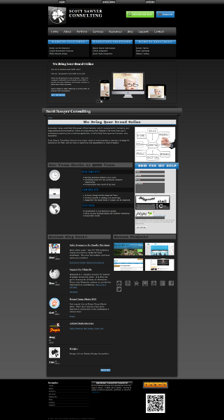
Provide a Mobile "Themed" Website
On a technical level, this takes the most to setup, but, for me, is much easier to maintain. Using a mobile theme allows me to focus on building functionality and content only once, but know my mobile users receive the same content as a desktop user.
A mobile theme can be provided by a variety of ways, from the most basic of switching stylesheets to a more mobile friendly version, to completely restructuring the HTML, CSS, and JavaScript for mobile users. This second approach is the one I took with our current site.
.png)
Mobile Website Theme

Desktop Website Theme
To me this offers the best of both worlds. My mobile website users have access to all the same content, but formatted for their screen and capabilities.
While this is the best option for our strategy, there are some drawbacks to consider.
- While the interface is customized for the mobile experience, the content largely is not.
- Effectively "skinning" or theming a large or existing site is quite challenging.
- Even when you simplify the interface, the site may seem slower than expected for mobile users.
Conclusion
There are many ways for a business to bring their Website to mobile users, the best way is the one that makes the most sense for your situation.
There will be a follow up post that goes into more detail as to how we actually built our mobile site, our challenges and results.
If you like, visit our site on your mobile site, and let us know what you think.
Questions
How has your organization addressed mobile?
What route did you choose?
What challenges did you face?